
SaaS & Productivity
Loom
Freesaas-productivity. Wide open white canvas, heroic heavy-display headlines in Charlie Display, bright cobalt primary (#1868db) used as bold call-to-action and full-bleed band color, playful rounded cards in pastel fills and stacked device artwork.
Source · loom.com
The DESIGN.md
Drop this file into your project and tell your agent to follow it: colors, type, spacing, and the reasoning behind them. A style match, never a pixel copy.
DESIGN.md
---
name: "Loom"
description: "saas-productivity. Wide open white canvas, heroic heavy-display headlines in Charlie Display, bright cobalt primary (#1868db) used as bold call-to-action and full-bleed band color, playful rounded cards in pastel fills and stacked device artwork."
colors:
  primary: "#1868db"
  canvas: "#ffffff"
  ink: "#101214"
  ink-muted: "#292a2e"
  surface-dark: "#123263"
  accent-violet: "#bf63f3"
  accent-yellow: "#fff5d4"
typography:
  display:
    fontFamily: "\"Charlie Display\", sans-serif"
    fontSize: "3.9562rem"
    fontWeight: "700"
    lineHeight: "1.03"
  section-heading:
    fontFamily: "\"Charlie Display\", sans-serif"
    fontSize: "3.9562rem"
    fontWeight: "700"
    lineHeight: "1.03"
  subheading:
    fontFamily: "\"Charlie Display\", sans-serif"
    fontSize: "1.5813rem"
    fontWeight: "700"
    lineHeight: "1.33"
  uppercase-label:
    fontFamily: "\"Charlie Text\", sans-serif"
    fontSize: "0.7875rem"
    fontWeight: "700"
    lineHeight: "1.46"
    textTransform: "uppercase"
  body:
    fontFamily: "\"Charlie Text\", sans-serif"
    fontSize: "1.1625rem"
    fontWeight: "400"
    lineHeight: "1.65"
  list:
    fontFamily: "\"Charlie Text\", sans-serif"
    fontSize: "1rem"
    fontWeight: "400"
    lineHeight: "1.5"
  quote:
    fontFamily: "\"Charlie Display\", sans-serif"
    fontSize: "1.5813rem"
    fontWeight: "700"
    lineHeight: "1.33"
  caption:
    fontFamily: "\"Charlie Text\", sans-serif"
    fontSize: "1rem"
    fontWeight: "400"
    lineHeight: "1.5"
  badge-label:
    fontFamily: "\"Charlie Text\", sans-serif"
    fontSize: "0.7875rem"
    fontWeight: "700"
    lineHeight: "1.46"
    textTransform: "uppercase"
rounded:
  xs: "12px"
  sm: "42px"
  md: "50px"
  lg: "69px"
  full: "9999px"
spacing:
  xs: "8px"
  sm: "16px"
  md: "24px"
  lg: "32px"
  xl: "56px"
  2xl: "71px"
  3xl: "91px"
  4xl: "111px"
containerMaxWidth: "1600px"
---

> Reverse-engineered from a live Chrome session on [https://loom.com](https://loom.com) — computed styles, DOM inspection, and pixel sampling. Values are **measured, not estimated**, unless flagged.

## Overview

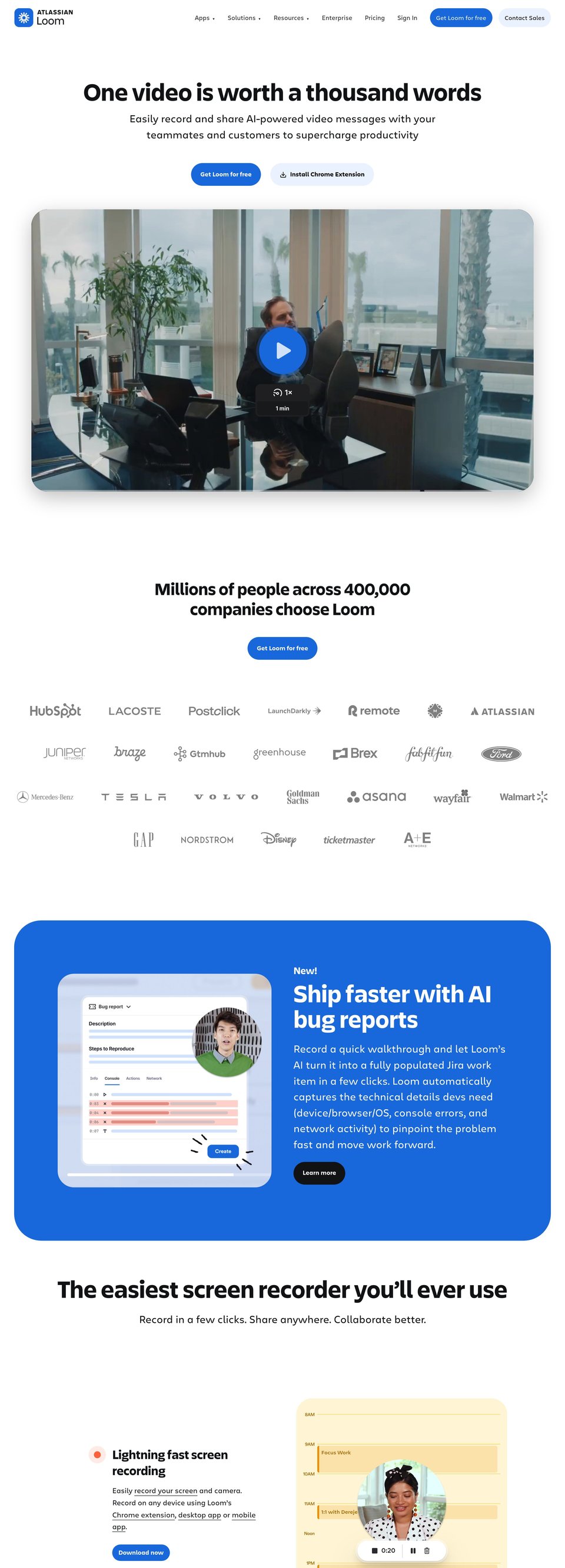
Loom's public site language is confident, airy and commercially direct: very large, heavy display headlines sit on a vast white field, then the page punctuates with saturated cobalt bands and playful pastel card blocks. The type pairing is a clean two-face system — "Charlie Display" for bold, geometric headlines and "Charlie Text" for human-scale body copy — creating a friendly but authoritative voice.

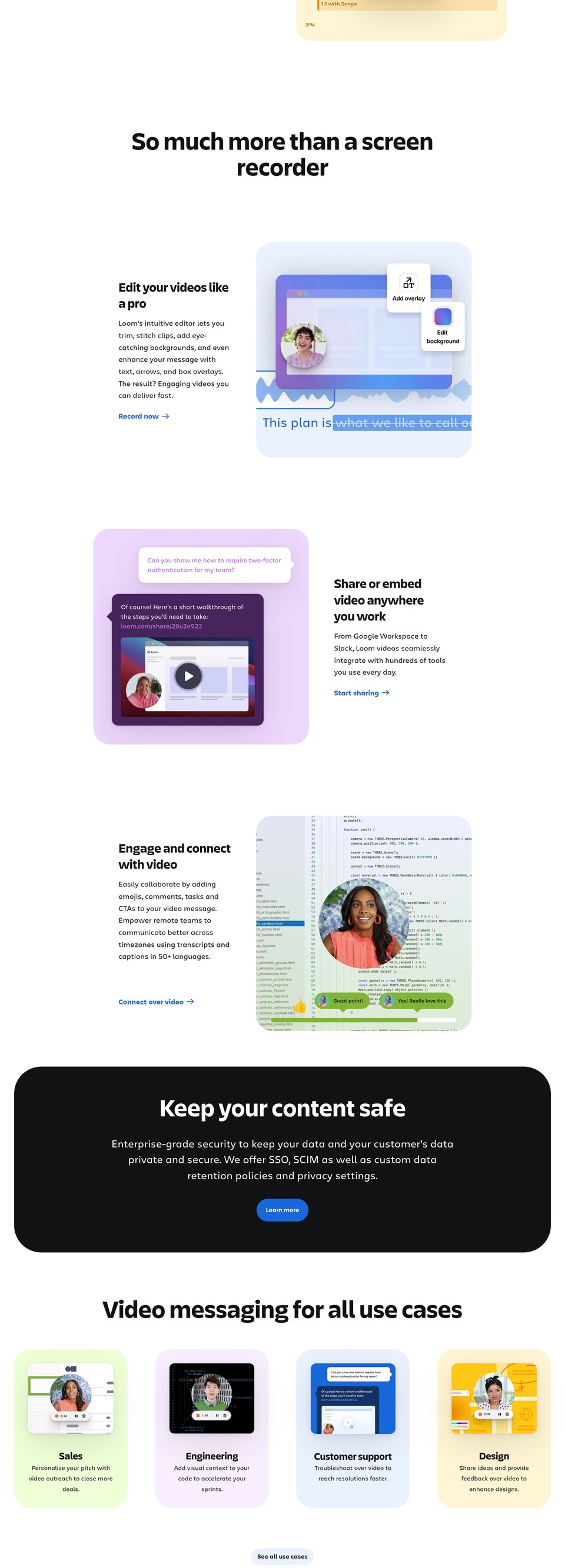
Color drives hierarchy: #1868db appears as the unmistakable brand accent (CTAs and full-width bands), while #ffffff and #101214 provide the high-contrast canvas and ink. Pastel-filled rounded cards (greens, violets, blues, yellows measured in CSS vars like "--thd-color-violet-10": "#f8eefe" and "--thd-color-green-10": "#efffd6") form a recurring motif — each card is a soft rounded rectangle with a circular avatar and subtle inner artwork.

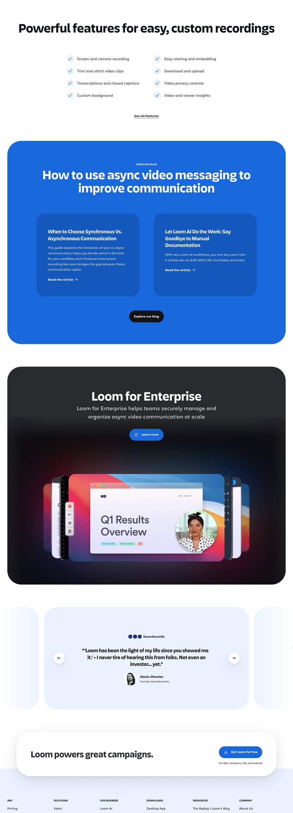
The site's signature artwork treatment alternates two approaches: 1) playful, flattened illustrative cards in soft pastel fills with heavy corner radii and circular cropped portrait photos; 2) larger stacked-device photographic/3D compositions set over a dramatic, near-black gradient backdrop (the gradient and deep surfaces are represented by values such as "#123263" and "#101214" in measured variables). Rounded corners, pill CTAs and circular avatars repeat across scales to keep the language approachable. Photography/artwork color accents pick up the brand cobalt and violet tones for continuity.

Where the measurement set is silent, specifics are "not measured" (for example: exact image asset file names and internal illustration grid). Use the measured tokens and visible rhythm as the authoritative guide when translating this voice to a different product.

**Key characteristics**
- dominant, heavy-display headlines (Charlie Display at 63.3px) paired with a generous, humanist text size (Charlie Text at 18.6px).
- single-pill CTA geometry for primary actions (button borderRadius: "9999px") supported by a small-system of large rounded card radii (cards: "41.6923px" and measured radii list includes "69px", "42px").
- brand cobalt as primary signal (exact: "#1868db") used both as CTA fill and as full-width band background to create rhythm.
- pastel rounded cards as repeating motif (measured vars: "--thd-color-violet-10": "#f8eefe", "--thd-color-green-10": "#efffd6", "--thd-color-blue-10": "#e9f2fe", "--thd-color-yellow-10": "#fff5d4").
- light, open vertical rhythm with measured spacing steps such as "16px", "24px", "32px" and large section breaks like "111px" and "91px".
- shadows used sparingly — subtle elevation via the measured "--thd-shadow" string rather than heavy skeuomorphic depth.

*A style reference distilled from [https://loom.com](https://loom.com) — never a pixel copy.*

## Colors

### Palette (by role)
| Token | Value | Usage |
|---|---|---|
| primary | #1868db | Primary CTA and full-bleed brand bands (Get Loom for free buttons, band background blocks). |
| canvas | #ffffff | Main page background and card interiors. |
| ink | #101214 | Primary body and headline text color. |
| ink-muted | #292a2e | Secondary text, nav links and paragraph copy. |
| surface-dark | #123263 | Deep surface used for occasional dark cards and stacked-artwork backdrop. |
| accent-violet | #bf63f3 | Accent and decorative highlights inside artwork and small UI badges. |
| accent-yellow | #fff5d4 | Warm pastel card background option and subtle surface emphasis. |

### Surfaces (measured, area-weighted)
| Background | Weight |
|---|---|
| #ffffff | ×677 |
| #e9f2fe | ×522 |
| #1868db | ×255 |
| #101214 | ×159 |
| #292a2e | ×147 |
| #123263 | ×41 |
| #1558bc | ×41 |
| #eed7fc | ×30 |
| #48245d | ×13 |
| #f8eefe | ×12 |
| #fff5d4 | ×12 |
| #efffd6 | ×12 |

### Ink (measured text colors)
| Color | Elements |
|---|---|
| #101214 | ×111 |
| #292a2e | ×26 |
| #ffffff | ×20 |
| #bf63f3 | ×2 |
| #000000 | ×1 |
| #c97cf4 | ×1 |

### Gradients (computed, exact stops)
- `linear-gradient(rgba(0, 0, 0, 0.07), rgba(0, 0, 0, 0))`
- `linear-gradient(to top, rgb(179, 223, 114), rgba(255, 255, 255, 0))`
- `linear-gradient(rgb(255, 255, 255) 0px, rgb(255, 255, 255) 55%, rgb(233, 242, 254) 55%, rgb(233, 242, 254) 100%)`

### The site's own tokens (CSS custom properties)
| Variable | Computed value |
|---|---|
| `--lns-color-body` | hsla(228,6%,17%,1) |
| `--lns-color-bodyDimmed` | hsla(224,5%,44%,1) |
| `--lns-color-background` | hsla(0,0%,100%,1) |
| `--lns-color-backgroundHover` | hsla(209,75.6%,8%,0.08) |
| `--lns-color-backgroundActive` | hsla(225.5,56.9%,10%,0.14) |
| `--lns-color-overlay` | hsla(0,0%,100%,1) |
| `--lns-color-primary` | hsla(215.4,80%,47.65%,1) |
| `--lns-color-primaryHover` | hsla(215.9,79.9%,41%,1) |
| `--lns-color-primaryActive` | hsla(216.3,69.2%,22.9%,1) |
| `--lns-color-focusRing` | hsla(216.1,81.4%,60%,1) |
| `--lns-color-record` | hsla(11,100%,62.2%,1) |
| `--lns-color-recordHover` | hsla(11,100%,52.2%,1) |
| `--lns-color-recordActive` | hsla(11,100%,42.2%,1) |
| `--lns-color-border` | hsla(225.5,57%,10%,0.14) |
| `--lns-color-disabledContent` | hsla(223,5%,73%,1) |
| `--lns-color-disabledBackground` | hsla(0,0%,9%,0.03) |
| `--lns-color-backdrop` | hsla(224,72%,7%,0.46) |
| `--lns-color-formFieldBorder` | hsla(223.6,5%,57%,1) |
| `--lns-color-formFieldBackground` | hsla(0,0%,100%,1) |
| `--thd-nav-h` | 5.625rem |
| `--thd-nav-sm-h-logged-in` | 37.5rem |
| `--thd-nav-sm-h-logged-out` | 10rem |
| `--thd-screen-xs` | 23.4375rem |
| `--thd-screen-sm` | 40rem |
| `--thd-screen-md` | 48rem |
| `--thd-screen-lg` | 64rem |
| `--thd-screen-xl` | 80rem |
| `--thd-screen-2xl` | 84.875rem |
| `--thd-screen-3xl` | 100rem |
| `--thd-screen-4xl` | 120rem |
| `--thd-screen-5xl` | 142.75rem |
| `--thd-color-grey-10` | #f8f8f8 |
| `--thd-color-grey-20` | #f0f1f2 |
| `--thd-color-grey-30` | #dddee1 |
| `--thd-color-grey-40` | #b7b9be |
| `--thd-color-grey-50` | #8c8f97 |
| `--thd-color-grey-50-50` | #8c8f9780 |
| `--thd-color-grey-60` | #7d818a |
| `--thd-color-grey-70` | #6c6f77 |
| `--thd-color-grey-80` | #505258 |

*(+111 more captured)*

Use and hierarchy
- Primary CTA and brand moments use exact hex "#1868db" (measured as both background and CSS var "--thd-color-blue-70": "#1868db").
- Page canvas is "#ffffff" for maximum clarity and contrast with large display type.
- Primary ink is "#101214" (measured as "--thd-color-black" and primary text color); secondary/ muted text uses "#292a2e" (measured as "--thd-color-grey-100": "#292a2e").
- Pastel surface palette is available as measured CSS vars: "--thd-color-violet-10": "#f8eefe", "--thd-color-blue-10": "#e9f2fe", "--thd-color-green-10": "#efffd6", "--thd-color-yellow-10": "#fff5d4" — use these for card backgrounds and soft highlights.
- Accent colors (e.g., "#bf63f3" from "--thd-color-violet-50") are for small UI highlights and in-artwork accents, not for primary CTA replacement.
- For dark bands or deep artwork backdrops, measured darker blues such as "#123263" and black "#101214" are used; where a graded effect is needed, use the measured gradient "--thd-color-blue-gradient": "linear-gradient(135deg,#4d8ced 0%,#1868db 100%)".
- When increasing emphasis, apply the measured highlight overlay variables (e.g., "--lns-color-highlight": "hsla(215.4,80%,47.65%,0.15)").
- If a color role is not in the measurement set, mark it as not measured and default to the nearest palette token above.

## Typography

### Families (computed)
| Stack | Headings | Body | Chrome |
|---|---|---|---|
| "Charlie Text", sans-serif | ×6 | ×326 | ×3 |
| "Charlie Display", sans-serif | ×20 | ×2 | ×0 |

### Type scale (measured)
| Token | Size | Weight | Line-height | Letter-spacing | Case | Family | Role |
|---|---|---|---|---|---|---|---|
| display | 63.3px (3.9562rem) | 700 | 65.1px (1.03) | 0 | — | Charlie Display | Hero headline voice — oversized, weighty callout for the main message (fontFamily: "Charlie Display", sans-serif; fontSizePx: 63.3; fontWeight: 700; lineHeightPx: 65.1; color: #101214). |
| section-heading | 63.3px (3.9562rem) | 700 | 65.1px (1.03) | 0 | — | Charlie Display | Secondary large headings that appear on colored bands and dark artwork (fontFamily: "Charlie Display", sans-serif; fontSizePx: 63.3; fontWeight: 700; lineHeightPx: 65.1; color: #ffffff). |
| subheading | 25.3px (1.5813rem) | 700 | 33.7px (1.33) | 0 | — | Charlie Display | Column and card headings (fontFamily: "Charlie Display", sans-serif; fontSizePx: 25.3; fontWeight: 700; lineHeightPx: 33.7; color: #101214). |
| uppercase-label | 12.6px (0.7875rem) | 700 | 18.4px (1.46) | 0 | uppercase | Charlie Text | Small uppercase labels and chrome labels (fontFamily: "Charlie Text", sans-serif; fontSizePx: 12.6; fontWeight: 700; lineHeightPx: 18.4; textTransform: uppercase; color: #101214). |
| body | 18.6px (1.1625rem) | 400 | 30.7px (1.65) | 0 | — | Charlie Text | Primary paragraph voice for marketing copy (fontFamily: "Charlie Text", sans-serif; fontSizePx: 18.6; fontWeight: 400; lineHeightPx: 30.7; color: #101214). |
| list | 16px (1rem) | 400 | 24px (1.5) | 0 | — | Charlie Text | List items and smaller body copy (fontFamily: "Charlie Text", sans-serif; fontSizePx: 16; fontWeight: 400; lineHeightPx: 24; color: #292a2e). |
| quote | 25.3px (1.5813rem) | 700 | 33.7px (1.33) | 0 | — | Charlie Display | Prominent quoted/testimonial block voice (fontFamily: "Charlie Display", sans-serif; fontSizePx: 25.3; fontWeight: 700; lineHeightPx: 33.7; color: #101214). |
| caption | 16px (1rem) | 400 | 24px (1.5) | 0 | — | Charlie Text | Small descriptive text beneath images (fontFamily: "Charlie Text", sans-serif; fontSizePx: 16; fontWeight: 400; lineHeightPx: 24; color: #101214). |
| badge-label | 12.6px (0.7875rem) | 700 | 18.4px (1.46) | 0 | uppercase | Charlie Text | On-brand uppercase micro-label used in hero CTAs and small badges (fontFamily: "Charlie Text", sans-serif; fontSizePx: 12.6; fontWeight: 700; lineHeightPx: 18.4; textTransform: uppercase; color: #ffffff). |

- Pairing: "Charlie Display" is the headline voice and appears at large sizes (h1/h2 at fontSizePx: 63.3, fontWeight: 700). "Charlie Text" is the body/chrome face used at p 18.6px and li 16px (both measured). Use the measured scales verbatim for hero and section headings.
- Scale and weight: keep h1/h2 bold (700) and large (63.3px) to preserve the brand's punch. Body copy uses 18.6px/400 with comfortable line-height 30.7px as measured.
- Contrast: primary text should use "#101214" for AA/AAA contrast against "#ffffff". Secondary text may use "#292a2e" for reduced emphasis.
- Microcopy: uppercase labels (selector "h4") use fontSizePx: 12.6, fontWeight: 700 and textTransform: uppercase as measured for small chrome elements and overline badges.
- If additional type sizes are required outside the measured scale, annotate as not measured and scale rhythmically relative to the measured steps (do not reduce headline weight below 700 for hero treatments).

## Layout

- Container max-widths (measured): 1600px (×13), 619px (×8), 878px (×5), 1163px (×4), 702px (×4), 1440px (×2).
- Spacing steps in use (section paddings + flex/grid gaps): 16px (×42), 111px (×14), 71px (×11), 24px (×4), 32px (×4), 91px (×3), 8px (×1), 56px (×1), 36px (×1).
- Page height at 1440px viewport: 12627px.

### Surface rhythm, top to bottom (measured)
| Band | Background | Text | ≈Height |
|---|---|---|---|
| 1 | #e9f2fe | #000000 | 902px |
| 2 | #ffffff | #292a2e | 1804px |
| 3 | #1868db | #292a2e | 902px |
| 4 | #ffffff | #292a2e | 1804px |
| 5 | #eed7fc | #292a2e | 902px |
| 6 | #101214 | #292a2e | 902px |
| 7 | #ffffff | #292a2e | 1804px |
| 8 | #1868db | #292a2e | 902px |
| 9 | #292a2e | #292a2e | 902px |
| 10 | #e9f2fe | #101214 | 1804px |

- Vertical spacing: the site uses a small step of "16px" (measured) for local spacing; larger section breaks registered at "111px", "91px", "71px" and "32px" — use these exact values to maintain rhythm between large sections and hero gaps.
- Container widths: measured container max widths include "1600px", "1440px" and a range of smaller breakpoints (e.g., "--thd-screen-xl": "80rem", "--thd-screen-lg": "64rem"). Use the measured container max widths for wide layouts and center content inside them.
- Grid and cards: card widths in the use-case grid read as evenly spaced columns with large internal padding (sample card padding measured at "36.16px") and card radii such as "41.6923px". Preserve that airy, card-first grid with ample white space.
- Navigation: measured nav height is 90px and the nav is sticky with a white background; preserve space for prominent nav CTAs (Get Loom for free / Contact Sales).

## Elevation & Depth

### Shadows in use (measured)
| Box-shadow | Elements |
|---|---|
| `rgba(0, 0, 0, 0) 0px 0px 0px 0px, rgba(0, 0, 0, 0) 0px 0px 0px 0px, rgba(0, 0, 0, 0.04) 0px 2px 6px 0px, rgba(0, 0, 0, 0.06) 0px 5px 18px 0p` | ×5 |
| `rgba(0, 0, 0, 0) 0px 0px 0px 4.45038px` | ×3 |
| `rgba(0, 0, 0, 0.04) 0px 2px 6px 0px, rgba(0, 0, 0, 0.06) 0px 5px 18px 0px, rgba(0, 0, 0, 0.1) 0px 24px 83px 0px` | ×2 |
| `rgba(0, 0, 0, 0.03) 0px 4px 6.4px 0px, rgba(0, 0, 0, 0.05) 0px 3px 9.6px 0px, rgba(0, 0, 0, 0.07) 0px 8px 32px 0px, rgba(0, 0, 0, 0.1) 0px 3` | ×2 |
| `rgba(0, 0, 0, 0.25) 0px 15px 50px 0px` | ×1 |
| `rgba(0, 0, 0, 0.25) 0px 3.24px 3.24px 0px` | ×1 |
| `rgba(255, 255, 255, 0.4) 0px 0px 0px 5px, rgba(0, 0, 0, 0.17) 0px 45.612px 86.879px 0px, rgba(0, 0, 0, 0.11) 0px 13.751px 26.192px 0px, rgba` | ×1 |
| `rgba(0, 0, 0, 0.2) 0px 6px 6px 3px` | ×1 |

- Shadows are deliberately subtle. The primary measured elevation token is "--thd-shadow": "0 0.125rem 0.375rem 0px rgba(0,0,0,.04),0px 0.3125rem 1.125rem 0 rgba(0,0,0,.06),0 1.5rem 5.1875rem 0 rgba(0,0,0,.1)" — use this for modal / card lift sparingly.
- Many cards and CTAs are flat (boxShadow: "none" in measured buttons and cards), relying on radius and color contrast rather than heavy drop shadows.
- For high-emphasis overlays use measured backdrop vars such as "--thd-color-overlay": "rgba(0,0,0,.5)" or the newer LNS backdrop tokens (e.g., "--lns-color-backdropDark": "hsla(228,6%,17%,0.9)") as needed.
- If a required shadow style is not in measurements, mark it not measured and prefer the existing "--thd-shadow" for consistency.

## Shapes

Border-radius scale, from computed values across the DOM:
| Radius | Elements |
|---|---|
| pill | ×63 |
| 69px | ×20 |
| 42px | ×17 |
| 12px | ×4 |
| 50px | ×2 |
| 6px | ×2 |
| 16px | ×2 |
| 8px | ×1 |

## Components

### Buttons (measured variants)
| Background | Text | Border | Radius | Padding | Type | Case | Seen |
|---|---|---|---|---|---|---|---|
| #1868db | #ffffff | none | 9999px | 7.80769px 15.6154px | 15.6px/400 Charlie Text | — | ×7 |
| rgba(0, 0, 0, 0) | #292a2e | none | 9999px | 8px 16px | 16px/400 Charlie Text | — | ×3 |
| #e9f2fe | #000000 | none | 9999px | 7.80769px 15.6154px | 15.6px/400 Charlie Text | — | ×2 |
| #101214 | #ffffff | none | 9999px | 15.6154px 23.4231px | 15.6px/700 Charlie Text | — | ×2 |
| #e9f2fe | #292a2e | none | 9999px | 7.80769px 15.6154px | 15.6px/700 Charlie Text | — | ×1 |

### Cards & panels
| Background | Text | Border | Radius | Padding | Type | Case | Seen |
|---|---|---|---|---|---|---|---|
| rgba(0, 0, 0, 0) | #292a2e | none | 41.6923px | 0px | 16px/400 Charlie Text | — | ×3 |
| #ffffff | #292a2e | none | 41.6923px 0px 0px 41.6923px | 0px | 16px/400 Charlie Text | — | ×2 |
| #123263 | #ffffff | none | 41.6923px | 0px | 16px/400 Charlie Text | — | ×2 |
| #48245d | #ffffff | none | 16px | 0px | 16px/400 Charlie Text | — | ×1 |
| rgba(0, 0, 0, 0) | #ffffff | none | 8px | 0px | 16px/400 Charlie Text | — | ×1 |
| #efffd6 | #101214 | none | 41.6923px | 36.16px | 16px/400 Charlie Text | — | ×1 |

### Navigation
Position `sticky`, painted surface `#ffffff`, height 90px, radius `0px`, shadow `none`.

### Footer
Surface `#f4f4f4`, text `#292a2e`.

### In-copy links
Color `#101214`, decoration `underline`.

- Buttons: Primary button measured sample uses background "#1868db", color "#ffffff", borderRadius "9999px", padding "7.80769px 15.6154px" and fontSizePx 15.6. Replicate the pill geometry and the measured padding/size relationship for primary CTAs. Secondary/ghost buttons can use a pale fill such as "#e9f2fe" (measured) with darker text.
- Cards: Measured card variants show flat fills or soft shadows. Use card radii "41.6923px" for the large pastel feature cards and smaller corners like "16px" for compact cards (both appear in radii measurements). Many cards have boxShadow: "none"; heavier artwork cards use the measured shadow "rgba(0, 0, 0, 0.04) 0px 2px 6px 0px, rgba(0, 0, 0, 0.06) 0px 5px 18px 0px, rgba(0, 0, 0, 0.1) 0px 24px 83px 0px" (copied from cards list).
- Nav & footer: Nav is sticky, background "#ffffff", heightPx: 90; primary nav CTAs are pill-shaped. Footer measured background is "#f4f4f4" with textColor "#292a2e".
- Inputs, badges: inputs were not measured in detail (not measured) — default to thin 1px borders using "--thd-color-grey-30": "#dddee1" and interior fill "#ffffff".
- Icons & avatar: circular avatars are a recurring motif; apply consistent circular crops and place them partially overlapping card artwork as in the screenshots (exact overlapping offsets not measured).

## Do's and Don'ts

- **Do:** keep hero headlines heavy and large — use the measured h1 size (fontSizePx: 63.3; fontWeight: 700).
- **Do:** use the exact brand cobalt "#1868db" for primary CTAs and band backgrounds.
- **Do:** favor pill buttons (borderRadius: "9999px") for all primary and prominent actions.
- **Do:** employ the pastel card fills from measured CSS vars (e.g., "--thd-color-violet-10": "#f8eefe", "--thd-color-green-10": "#efffd6") with large corner radii ("41.6923px") to create a friendly grid.
- **Do:** preserve measured spacing steps (16px/32px/111px) to maintain the page's airy rhythm.
- **Do:** rely on the measured subtle shadow token "--thd-shadow" for any elevated surfaces.
- **Don't:** replace the primary cobalt "#1868db" with a different hue for CTAs; it is the brand signal.
- **Don't:** use heavy, high-contrast backgrounds behind hero headlines unless you also switch headline color to the measured white variant (h2 measured with color: #ffffff).
- **Don't:** use sharp rectangular corners for main CTAs or feature cards — avoid breaking the rounded motif (measured radii emphasize pill/rounded corners).
- **Don't:** apply heavy, high-offset shadows — the system favors subtle elevation (use "--thd-shadow" instead of large custom drops).
- **Don't:** compress or downscale the display headline weight — keep 700 weight for hero presence.
Measured from the live site
The full-page capture this DESIGN.md was measured from. Values in the file are computed from a real session, not estimated.
loom.com
A design reference from loom.com, a public website: patterns, never its code or assets. Own this site? Request removal.